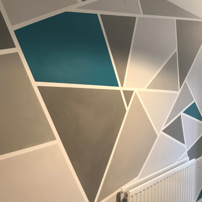
5 Tips to help you choose the right colour scheme when decorating your home.
Full article with thanks and credit to https://www.housebeautiful.com/uk/decorate/looks/a2069/decorating-designing-with-colour-home/
Using colour in the home and being bold in your choice of palette requires a lot of research and moodboards, and thanks to varying hues and textures, colour has the ability to completely transform a room.
World-renowned master architect, Jean-Michel Gathy, says the use of colour is the single most important element to consider when decorating any space. As principal designer of Denniston and with a career spanning more than four decades, Gathy’s legendary visionary has been behind many of the most iconic luxury hotels, resorts and destinations around the globe.
Here, Gathy shares his top five reasons as to why utilising colour is so crucial when designing a space.
Colour Creates Mood
We’ve previously explored how colour can set the tone and affect our mood, and when it comes to selecting the colour palette for our living space, Gathy stresses: ‘Colour has an immediate effect on mood — the ability to calm or invigorate — and creates energy and depth of field. It’s a powerful thing, and used intelligently, it can be a beacon for inspiration.’
Say ‘No’ to Monochrome
The timeless monochrome look has been reinvented with a ‘full spectrum from black to white, with a seemingly limitless palette of soft and bold greys in between,’ design experts Jordan Cluroe and Russell Whitehead, aka 2LG, noted earlier this year. But for a bold decorating look in the home, Gathy advises us to steer clear of tonal colour palettes as he says they don’t add enough excitement. ‘Too much tone on tone is quite boring,’ he says. ‘The colours you choose do not always have to match, but should rather complement one another.’
Messaging is Everything
Colour can send a strong message to guests and Gathy suggests the overall impression that we want to make through our use of colour should be taken seriously. ‘Colour has an immediate and enormous effect on the atmosphere,’ Gathy remarks. ‘If you enter a dark home, your mood instantly changes.’ Choosing colour schemes that carry the message you want to convey in your home will ensure that guests inherently understand your personality and overall aesthetic.
Proportion is Key
Bold colours and patterns are great to use, but in moderation. Gathy advises that colour proportion must be appropriate to the palette and pleasant to the eye. ‘Be careful not to over-mix patterns, otherwise they’ll start to compete with each other. Offset patterns with neutral breaks to create balance so the eye isn’t challenged. For example, if you have busy, multi-coloured pillows, opt for a more streamlined geometrical rug in black and white or tones of beige. Grounding the room with neutrals means you can add colourful highlights in the way of pillows, throw blankets, and rugs,’ he explains.
Create a Cohesive Connection
Adhering to unique themes in each room can work well, but it’s important to maintain a sense of continuity throughout, suggests Gathy. ‘The beauty of decorating a home is that each room can look and feel distinctive, so you can use a different colour scheme in every space if you choose. The trick is to create cohesiveness by choosing complementary colours where rooms connect,’ says Gathy.

